Visuals

Value Mandala
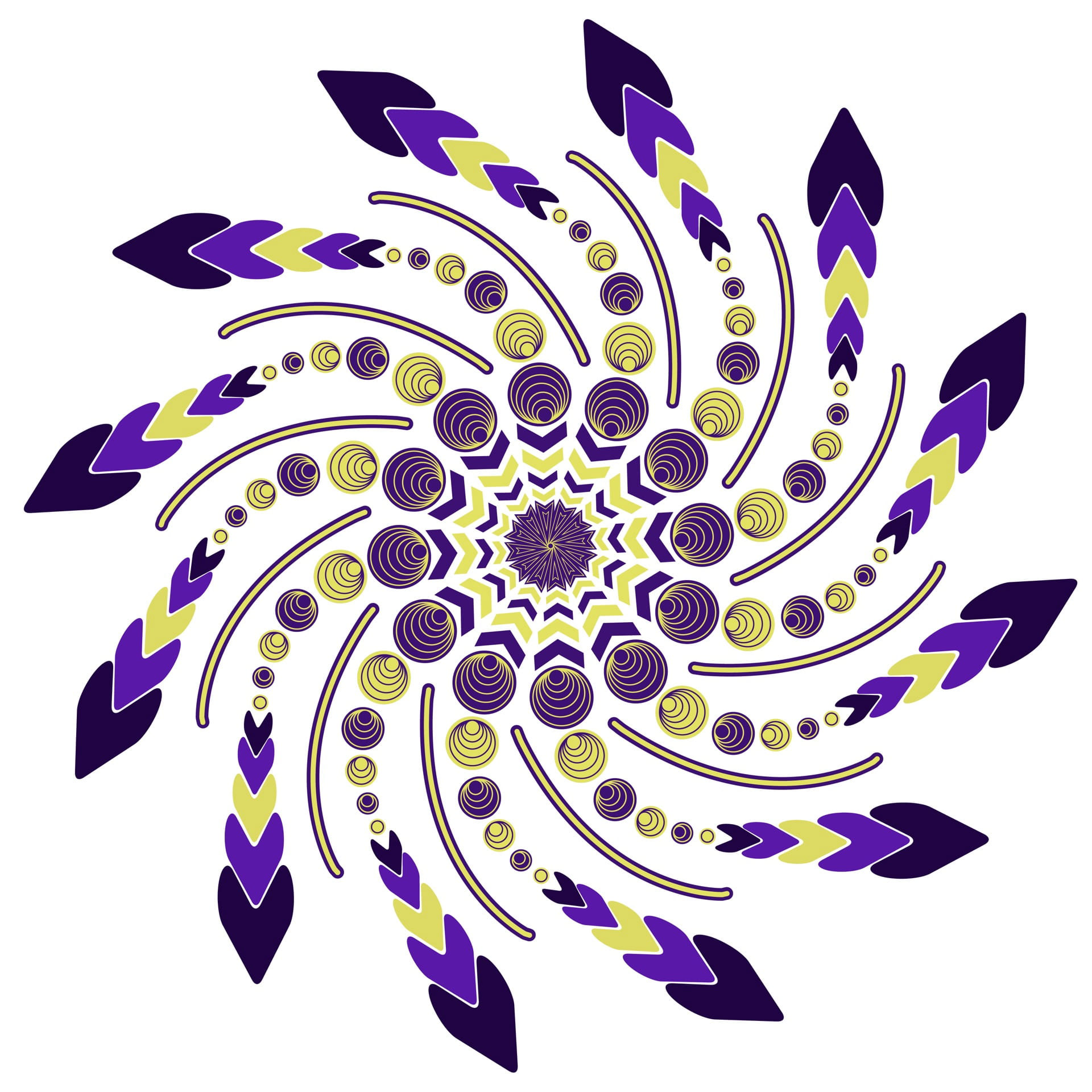
Complementary Mandala

Analogous Mandala
Project Statement
This project consisted of using patterns drawn from natural and physical objects to create a mandala that prioritized a principle of design while exploring different color harmonies to enhance the prioritized principle. I pulled patterns and abstractions from traffic signs, the moon, leaves, flags, and rainbows in order to create my mandala that focused on directional movement. In addition to creating a greyscale mandala, I also created a mandala in a blue analogous color scheme in order to create a sense of a whipping rotation and a mandala in a yellow-purple complementary color scheme in order to create a sense of a spinning optical illusion.
Process
View detailed project process at Patterning and Abstractions: Process
Reflection
In this project, I learned a lot about the importance of color schemes and values. I learned that having the correct color value can really elevate a composition. I wish that during this project I had more time to truly understand what makes one color scheme work better over another for certain compositions. I feel as if the blue analogous mandala follows and conveys my principle of directional movement the best. I still think the yellow-purple complementary convey directional movement, but just not as strong. I am proud of the way I composed my abstractions together. I feel like they fit together in a way that created a sense of unity among the abstractions. Although, I did struggle with the focal point of my mandala: I think it could have been stronger in conveying a stronger rotational feeling. But once again, I learned that during this process, iterations are crucial to the designing process. Creating just one more iteration could elevate my design to another level. I am excited to begin to use color in my compositions and gain a better understanding of color theory.