Visuals

Project Overview
Moving away from letterforms, you will continue to explore the dynamics of form and counter-form within photographs and the interaction between type and image. This exercise involves designing a progression of pages in book form, using an accordion fold structure.
The range of compositions throughout the book should include type and photographic images that flow in a rhythmic theme. Your studies should consider form progression, juxtaposition of image(s) and type (letters, words, sentences, and paragraphs), visual connection, and graphic space considerations. The progression must grow from the texture of a body of type to the inner forms of photographs. This exercise is to reveal photographic forms, not to display pictures. The visual rhythmic sequence is open for interpretation. The turning of each page and spread should offer surprises while still creating a consistent mood throughout the accordion book.
Process
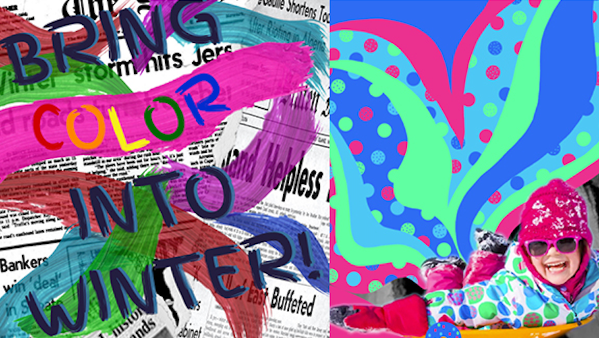
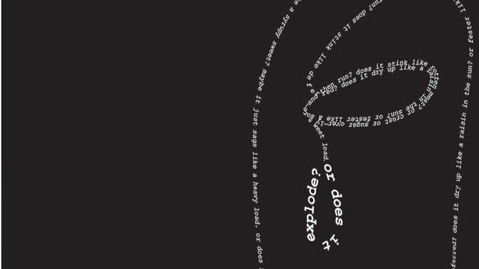
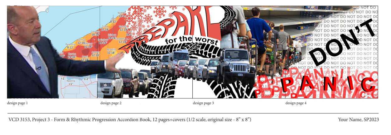
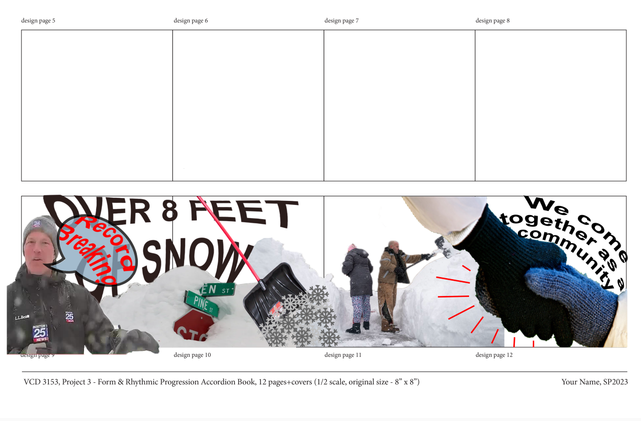
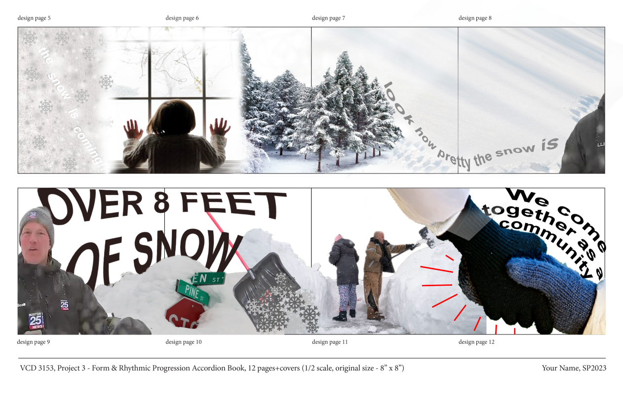
Continuing our theme of "Winter Pattern" and my narrative from previous projects, I designed an accordion book based off a winter storm: before, during, after. The design is continuous, focusing on form progression, juxtaposition of images, and type.
We approached this project is stages. We first focused on developing our concept based on our pervious two projects and the theme of winter pattern. My concept deals with a winter storm, showing the chaos and panic before the storm hits, the calm during the storm, and aftermath of a storm and a community coming together in times of need. Once a concept was chosen, we then moved on to identifying our visual theme and style. During this stage of our process we worked on 11x17 sheets, with a smaller layout, so we would design with a better idea of how our ideas were flowing as a whole. Once a visual style and theme was developed we moved onto developing our spreads in the final 8x8 format.
Below are some early iterations of my spreads and design style.

Reflection
Overall, I enjoyed this project. It proved to be very challenging at times. I struggled with integrating text within my design through this project. The text that I was adding was being seen as "visual" elements rather than textual ones. It was frustrating to hear that at fist because I didn't quite understand what that meant but after looking at examples from pervious years and further developing my design I understand how my beginning text was seen as "visual" elements and I agree with that statement as well. typography has been something that I struggled with all year; however, I am seeing progress within my work. I am happy how my final design ended up, I think my narrative and concept came through very clear to the audience.