Project Overview
Project Description:
This project used self tracked data in combination with visual methods to bring life to the data, revealing patterns, connections, and possible correlations. The project emphasized the holistic well-being of each student, using self-tracking data visualizations allowed students to use their insights to drive a deeper understanding of the data.
Objective:
The goal of my project was to explore patterns and connections between my daily social interactions (any activity or interaction I had with other people) and my stress levels over 14 days.
Data Collection
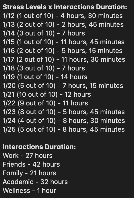
Data Points:
I tried to be track everything I thought of when thinking about my stress levels and social interactions. I wanted to track everything so I would have more data to work with in the long run. I also tracked my food and water intake and sleep but I did not end up using that data.
Things I was looking at for Social Interactions were:
- The Date
- Type of Interaction(s)
• Academic, Friends, Family, Work, Wellness
- The Time the Interaction Occurred During the Day
- The Duration of the Interaction(s) Individually
- The Total Duration of All of the Interactions for the Day
- Who the Interaction(s) were with
• Classmates, Friends, Coworkers, Family, Residents, Interviewee, Doctor
Things I was looking at for Stress Levels were:
- The Date
- Mood(s) for the Day
• Happy, Meh, Sad, Excited, Stressed, Anxious, Average, Irritated
- Overall Stress Level for the Day (1-10 Scale)
- Activities I did During the Day
- Stressors from the Day
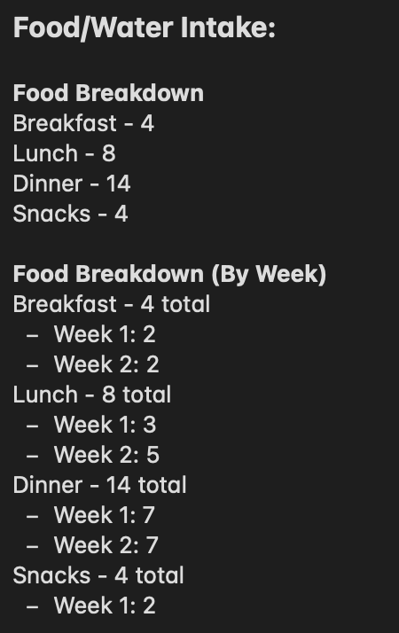
Things I was looking at for Food/Water Intake were:
- The Date
- Food Eaten for Breakfast, Lunch, and Dinner
- Any Snacks that I Ate
- Water I Drank (In Ounces)
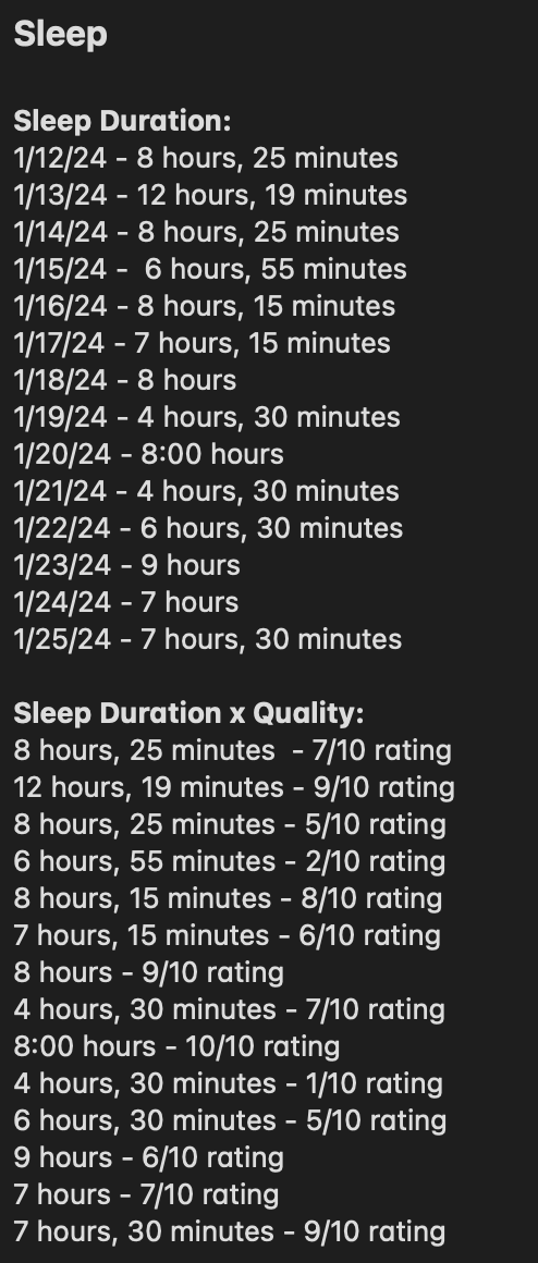
Things I was looking at for Sleep were:
- The Date
- Total Sleep Duration (At Night)
- Bedtime
- Wake Up Time
- Number of Dreams
- Noises I Heard
- Sleep Quality Rating (1-10 Scale)
Methodology:
All of my data tracking was done through manual logging on an Excel Sheet.
Pictures of my Excel Sheet:
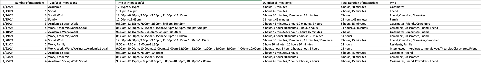
Social Interactions Tracker

Food/Water Intake Tracker
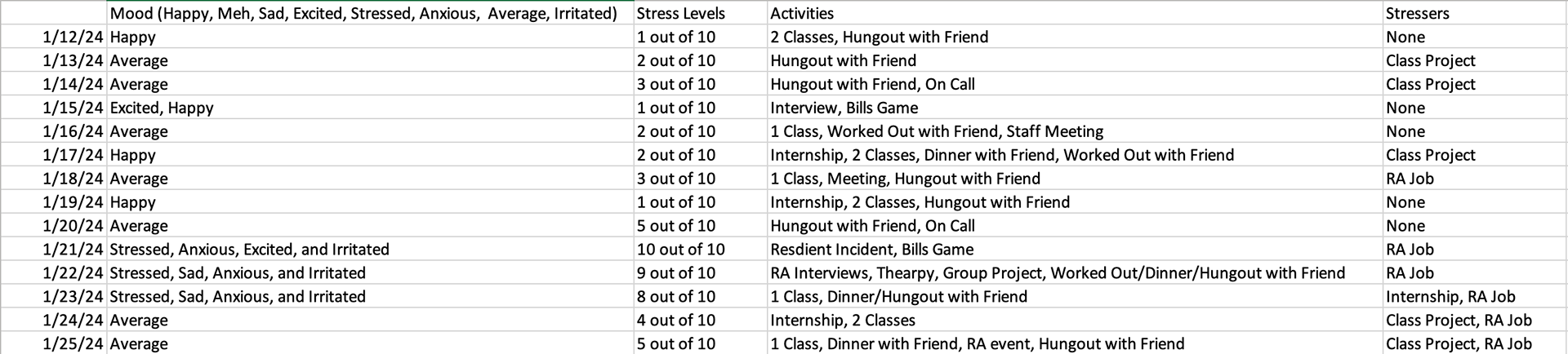
Stress Levels Tracker

Sleep Tracker
Timeline:
I collected all of my data over the course of 14 days, starting on Friday, January 12th and ending on Thursday, January 25th. I logged data in to my Excel Sheet every time something occurred that I was tracking. I would track data around six to fifteen times a day between the fours different types of data I was tracking.
Data Analysis
Below are pictures of my data breakdown.
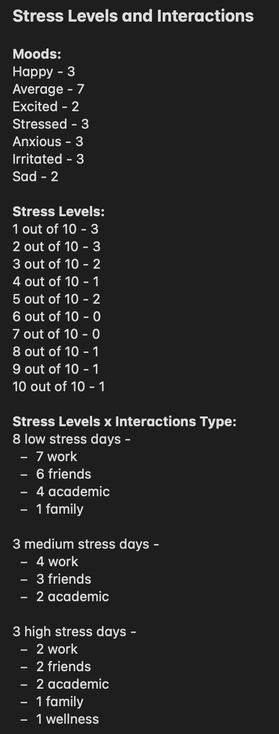
Initial Observations:
I honestly did not see any imitate patterns even after breaking my data down like this. It wasn't until after I started my design process and assigned colors to the different interactions did I see any patterns.
Tools & Techniques:
I used pretty much exclusively statistical methods to look at my data. I did a lot of looking at the totals of my different categories (time, activity type, etc.). I also looked at my ratings and tried to make sense in how they related to the total duration (sleep, interactions, etc.).
Findings:
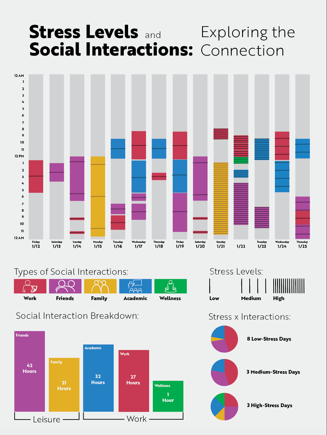
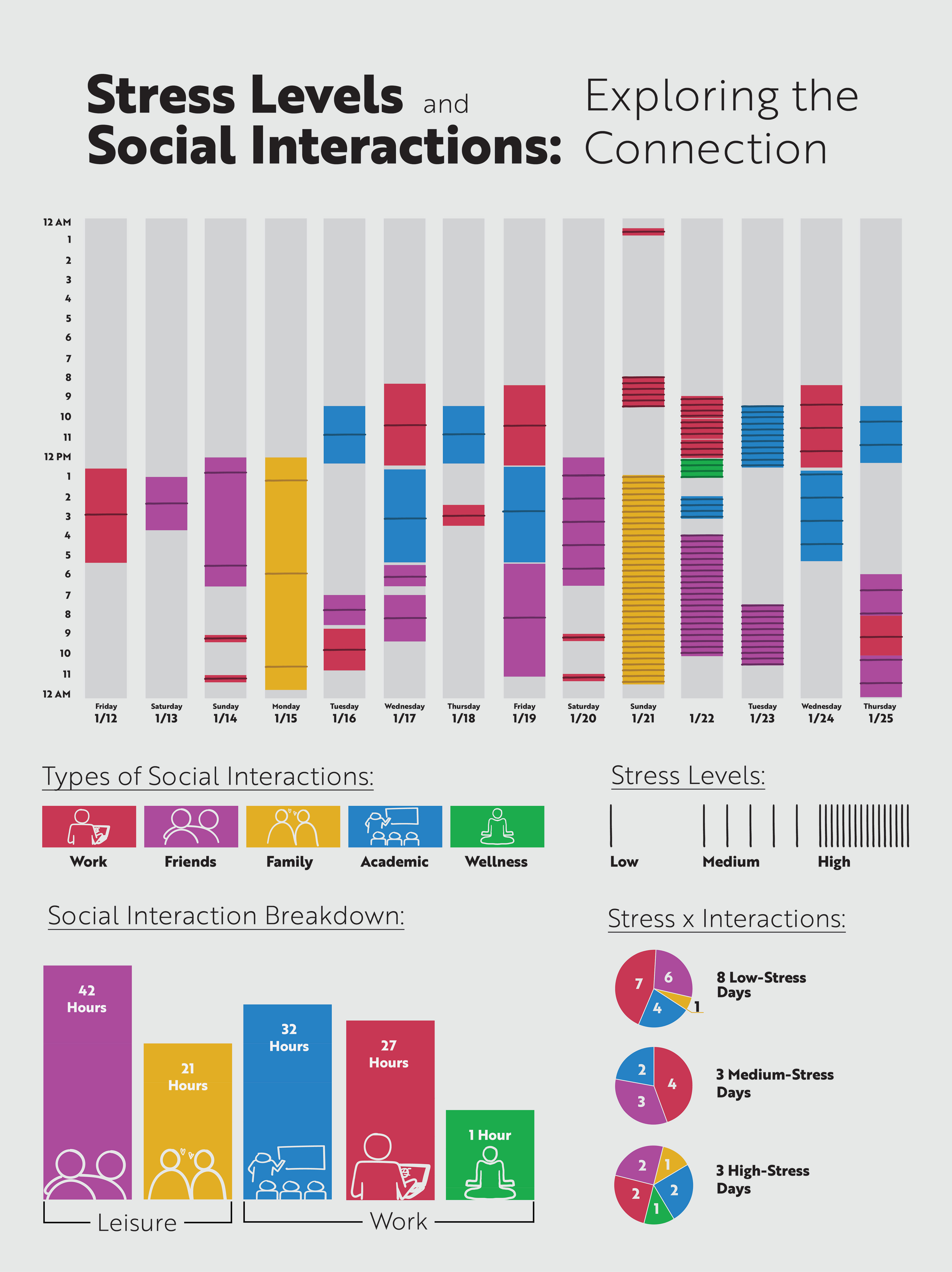
Once I started to apply my findings to visual methods of representing the data, I found that I was very connected to exploring the connections between my stress levels and social interactions. I noticed that on my lower stress days that I was with my friends a lot more than my higher stress days, this lead me to believe that there was a correlation between my stress levels and interactions. I thought that there was going to be a pattern with my higher stress days and having longer interaction durations for that day, but that ended up not being true, which was interesting.
Design Process
Concept Development:
Based on my data analysis, I felt like there was the most connections between my stress levels and social interactions. I wanted to see how I could visually explore the different connections I saw and breakdown how my social interactions had an impact on my stress levels. The type of social interaction, the duration of the interaction(s), and my stress levels influenced my design the most.
Drafts:
Draft One:
This was the first time visualizing my data. The top graph has to do with comparing how often I ate breakfast, lunch, and dinner and how those numbers compared from my first week of tracking data and the second week.
The second graph has to with comparing my stress levels and social interactions. The thicker the line for the stress levels indicates the amount of stressors and the height of the height of the line indicates the stress level on the scale from 1-10. The same thinking goes for the social interactions line: the thicker the line for the social interactions indicates a longer duration of the interaction and the height of the line indicates the amount of interactions I had.
The third graph has to do with breaking down the social interactions I had during each of the days. Looking at how long the interactions were, the type of interaction, and what time during the day did the interaction occur.

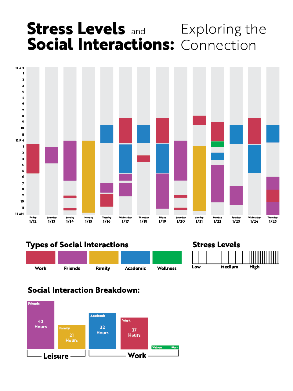
Draft Two:
*The two graphs on the top are the same graphs from my first draft*
Based on the feedback from my first draft, I needed to find a way to visually combine the contents of my second and third graphs. For my second draft I explored two ways of visually representing my social interactions and my stress levels.
The first graph resembles my second graft from draft one. I added keys onto my graph to help the information read more clearly and I took the social interactions line and added dots to show the types of interactions I had.
The second graph resembles my third graph from draft one. I kept the foundation of the graph and breaking down my interactions throughout the day. I changed my stress levels ranking system to low, medium, and high and I created a density pattern to the different levels of stress. The more dense the pattern the more stress.
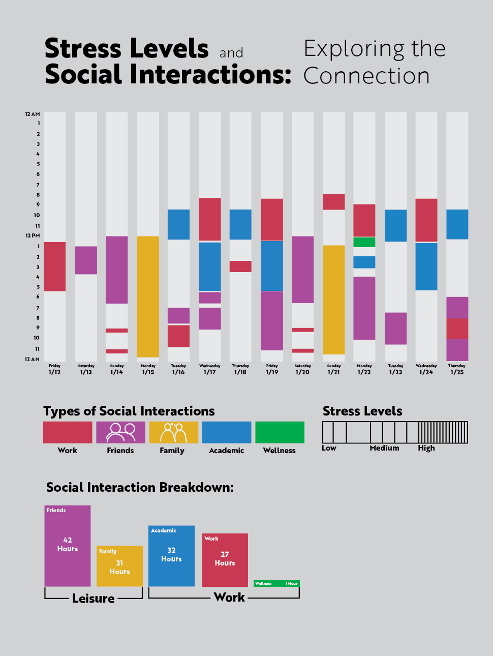
Draft Three:
Based on the feedback from my second draft, I decided to continue with the second draft from draft two. I felt like it was the most clear in breaking down my different social interactions throughout the days.
To further explore the connections between my social interactions and stress levels I wanted to break down the total hours of social interactions from he two weeks into the different categories, as well as, breakdown the stress levels (x amount of high, medium, and low days).
Some of the feedback I received for this draft going into digitally creating my poster was:
• Looking at the line directions on the days
• Color choice
• Density of the stress levels pattern
• Breaking down the social breakdown category into different categories
• Breaking down the social types inside of the stress breakdown.
Iterations:
Iteration One: My first digital draft. I was still working on how to breakdown the stress levels with combining the types of interactions. I focused on color selection and breaking my social interactions into two categories.
Iteration Two: Based on feedback I added a background color and started to explore adding icons to make my poster design feel a little less official and so sterile. I wanted to add a little bit of "fun" and personality into the poster. Through conversations with my professor we decided icons would be a good fit because they could also provide more context to what I was doing during each of the interactions.
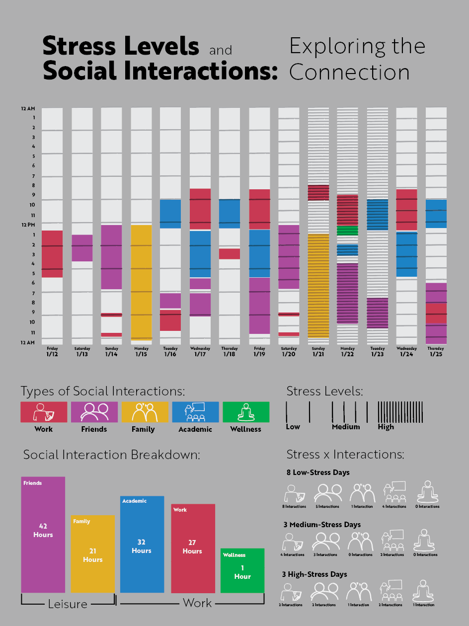
Iteration Three: I added in the density patterns for indicating the stress levels. I also began to explore how to breakdown the types of interactions within the stress levels breakdown. I also finished adding the icons in.
Iteration Four: Based on feedback, I found a way to more visually represent the stress levels breakdown. In interaction three the way I had previously done it, it felt very cluttered and hard to read. I also lightened up the background color and adjusted the density pattern to only show during my interaction times.
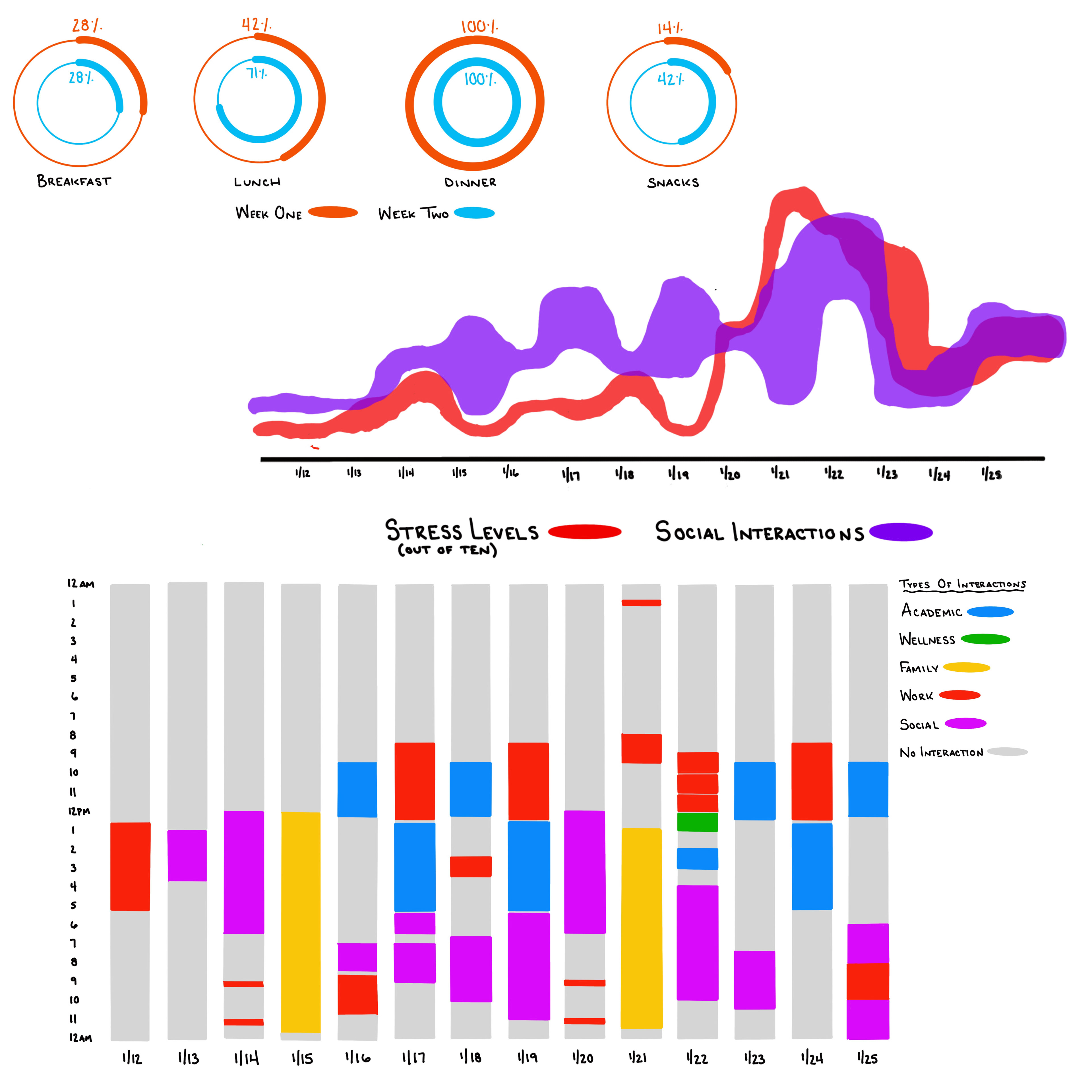
Final Design
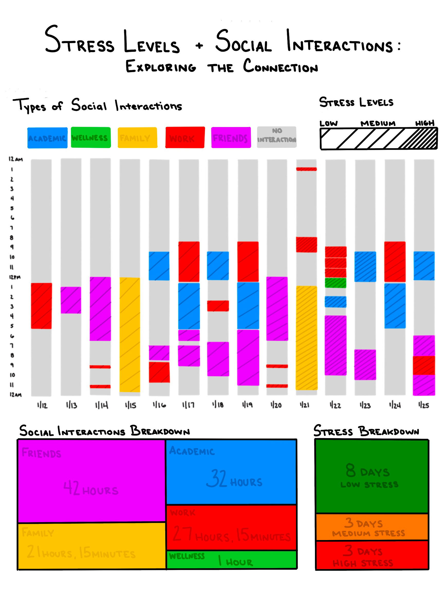
Final Poster Design:
The title of the poster is "Stress Levels and Social Interactions: Exploring the Connection." The upper part of the poster shows a timeline graph that breaks down the social interactions I had throughout my 14 day tracking period. In the different interaction blocks, there are lines in different densities to represent the stress level I experienced that day. The density increase as stress levels increase. I chose to put this information at the top of the poster because it provides context to the information below it and people read pages from top to bottom. Below the timeline graph is the key that breaks down what each of the colors mean and what the density of the line pattern means. I then broke down the social interactions and how the interactions and stress levels. The bottom part of the graph shows the insights that I discovered, the biggest one being that I found that I was less stressed on days that I had more social interactions with my friends.

Reflection
Overall, I am happy with the poster that I've created and how I have visually represented my data.
Challenges:
It was a little challenging for me to figure out how I wanted to represent the stress levels. I first started with having the density patten span over the entire day and then to just the interactions during the days. Through feedback from my peers and my professor I was able to land on a system that I liked visually and that I felt like accurately represented my data.
Learnings:
I learned about the importance of accurately representing your data and picking a visual method that best suites the data. I really saw the importance of that when I was in the draft stage of my design process. I had two different visual methods that represented almost all of the same information but one graph (the graph I continued with) was much more clear and effective in showing the information.
Future Directions:
If I could continue this project and tracking data, I'd love to track my stress levels during each of my individual interactions during a day. I only tracked my stress levels as a general thing for the entire day but as I was looking through all of my information and when I was visually representing the information, I wished I had tracked the stress levels more specifically so I could make another, deeper connection.